March 3, 2011
Have you ever thought about how the internet works? Or, better yet, how
it looks on a map? The folks at PEER 1 Hosting did, so they created
something so geeky, it’s cool: The Map of the Internet!
So what does it show? 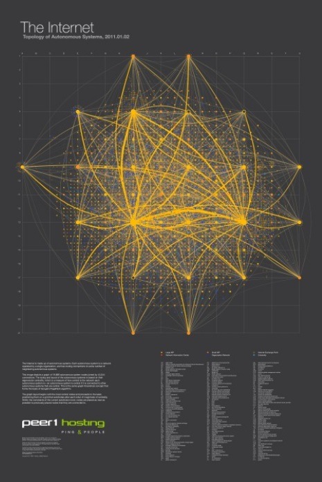
It’s a layout of all the networks that are interconnected to form the internet. Some are run by small and large ISPs, university networks, and customer networks-such as Facebook and Google. It’s visual representation of all those networks interconnecting with one another, forming the internet as we know it. Based on the size of the nodes and the thickness of the lines, it speaks to the size of those particular providers and the connections.
In technical speak, you’re looking at all the autonomous systems that make up the internet. Each autonomous system is a network operated by a single organization, and has routing connections to some number of neighbouring autonomous systems. The image depicts a graph of 19,869 autonomous system nodes, joined by 44,344 connections. The sizing and layout of the autonomous systems is based on their eigenvector centrality (a measure of the importance of a node in a network).
PEER 1 Hosting is on the map (grid position N10). It runs its own network across North America and Europe.
CLICK HERE or above for The Map of the Internet.
CLICK HERE for PEER1 Hosting.
Print this page