Features
Articles
A human-centric approach to illumination
November 26, 2018
By Matthew Blakeley
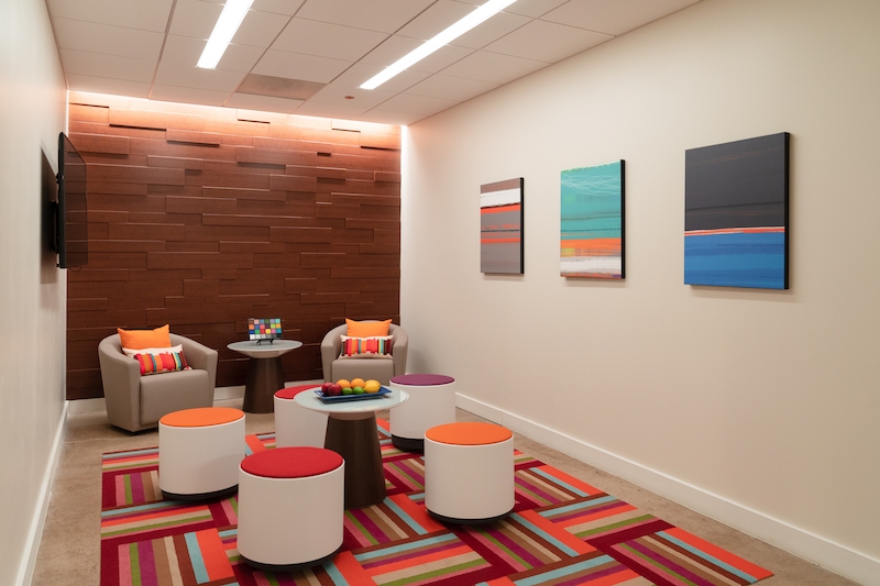
November 26, 2018 – It has long been the goal of architects and designers to create spaces for human comfort. For today’s workforce, especially, this means thoughtfully designed and built environments that help attract and retain top talent in the workforce and promote innovation and creativity.
Lighting is certainly an important contributor to the comfort of a space. And recent advances in light-emitting diode (LED) technology have provided greater flexibility, allowing designers to enhance commercial office environments through the integration of higher-quality light sources than were available in the past.
Quality versus efficacy
Ever since the commercialization of the Edison Electric Light Company’s filament bulb more than a century ago, the two central ideas of lighting—which have generally opposed each other—have been (a) to improve the efficiency of the light source or (b) to increase the quality of the light. This has often resulted in a compromise in the interest of efficiency but at the expense of quality.
Following the introduction of energy efficiency programs and codes, lighting upgrades in commercial buildings have focused primarily on reducing energy consumption. In the commercial and institutional sectors, which are responsible for 10% of all energy consumed in Canada, there has been a proliferation of energy-efficient building products. By way of example, these sectors improved their energy efficiency by 33% between 1990 and 2013.1
Yet, as lighting accounts for only 11% of the total energy consumption in commercial buildings and the efficacy of LEDs plateaus, it is now time to refocus the discussion on light quality. As the movement toward creating more ‘human-centric’ built environments escalates, designers are now looking to enhance spaces and provide more pleasing environments, while affecting energy savings only minimally.
A pleasant-feeling space is one where colours appear natural. To achieve this effect, the light source must render colours in a manner comparable to that of a blackbody. This is a theoretically perfect radiator of energy at all electromagnetic (EM) wavelengths, such as the sun.
After all, until the invention of the Edison bulb in the late 1800s, human beings knew only the sun and fire as their main sources of light. The burning filament of an incandescent light bulb mimicked the warmth and high red content of those natural light sources. For this reason, spaces illuminated with incandescent bulbs appeared welcoming and, generally, quite pleasing.
With the invention of fluorescent lamps, however, incandescent light sources came to be seen as comparatively inefficient. And in recent years, highly energy-efficient LEDs have easily surpassed fluorescent lamps in terms of efficacy, achieving lumens-per-watt (LPW) values of more than 140 in some cases.
This has still meant a significant trade-off. To maximize their efficacy, LEDs with a typically high colour rendering index (CRI) of 80 are oversaturated in the blue and green portions of the spectrum and undersaturated in red. The latest research into colour preferences has shown people prefer being immersed in environments where reds are slightly oversaturated; this indicates current, widely used LED technology is not ideal.
Tools to assess light quality
The CRI has been used since the 1960s to measure light quality by scoring its average rendering of colours. Generally, a score above 80 is desired. A score over 90 indicates more red content and more naturally rendered colours.
However, since (a) only eight colour samples are used to determine the average and (b) a true red is not included among them, the CRI score is not comprehensive. So, along with CRI, sometimes a special metric is included called R9, which only measures red fidelity.
In 2015, the Illuminating Engineering Society (IES) released TM-30-15, IES Method for Evaluating Light Source Color Rendition, breaking down measurements for rendered colour into three different metrics: a fidelity index (Rf), a gamut index (Rg) and a colour distortion graphic (a visual representation of colour saturation by hue bin). Notably, the fidelity measurement, Rf, used 99 colour samples, well beyond the CRI’s eight, which helped improve comparisons between products and blackbody reference sources at a correlated colour temperature (CCT) of 3,500 K.
The IES is now updating its method with the release of TM-30-18, providing an even more powerful tool to describe and quantify light quality. The TM-30-18 calculator outputs a new report that includes a more detailed colour rendition graph, as well as charts depicting local chroma shift, hue shift and colour fidelity. These data points are instrumental in not only quantifying percentage changes, but also providing information about the direction of change, hence supporting a better understanding of the resulting light quality.
Tests and analyses
Two independent research studies recently conducted in North America—at Pacific Northwest National Laboratories (PNNL)2 and Pennsylvania State University (PSU)3—support the argument that human-centric light should not be undersaturated, particularly in rendering red. While keeping the CCT and illuminance constant at 3,500 K, both studies varied fidelity, gamut and colour saturation to determine which types of light people preferred.
The PNNL study, published in June 2016, was used to promote the benefits of the TM-30-15 test method over traditional CRI measurements. First, PNNL set up a “typical room” for the experiment and populated it with a broad variety of items. Next, a group of 28 participants—selected to represent a cross-section of age and gender demographics—evaluated the space under differently rendered lighting conditions. Their responses to the test were evaluated statistically to enable the prediction of preferences. Finally, a regression analysis was developed to determine the relationships between the aforementioned variables.
Based on PNNL’s regression analysis of 16 hue bins, target saturation values should be between two and 16 per cent, the fidelity above 74 and the gamut above 100. And one of the main conclusions of this model was that people prefer more red content in their lighting.
In the PSU study, the results of which were published in December 2016, the researchers changed the method by which participants judged the space. Recognizing people can easily detect differences in light, PSU sought to confirm its findings with an “absolute” test.
To do so, the researchers tested only one rendered lighting source per day in the experimental setting. This ensured the participants’ preferences were not influenced by the other test sources they have previously seen.
Despite this difference, however, the PSU study’s findings converged with PNNL’s report. Both found the most preferred light sources oversaturated the red content.
These results were further corroborated by another study conducted by PNNL in 2017.4 Its results showed how increasing red saturation was applicable not only at 3,500 K, but indeed throughout a chromaticity range of 2,700 to 4,300 K.
Similar preference models were also observed in a fourth study at Zhejiang University5 in China. This suggests the association between oversaturation of red content and a more preferred light source is not necessarily specific to one cultural background.
Indeed, for reasons deeply rooted in psychology and anthropology, human beings overall prefer light that is slightly oversaturated in red content.
The psychology of colour
Research into the psychological impact of colour on human beings further supports the notion that a more comfortable environment can be created using light sources with higher red content.
According to studies by Andrew J. Elliot and Markus A. Maier,6 for example, colour “can carry meaning and have an important influence on affect, cognition and behaviour in achievement and affiliation/attraction contexts. Red, especially, has been shown to be a critical colour in this regard.”
When considering common uses of red, from stop signs, fire alarms and medical symbols to ‘rolling out the red carpet’ for VIPs, it should be no surprise how well red can evoke a strong response. As it turns out, people also exhibit their desire for intense colours on the web and in social media.
An in-depth research study performed by a team at the Georgia Institute of Technology (Georgia Tech) and Yahoo Labs7 analyzed more than seven million images on Flickr, about half of which originated on Instagram, to determine why people filter photos and whether doing so has an impact on ‘engagement’ for social media. The research showed the filtered photos achieved greater engagement than unfiltered images and, moreover, filters that altered images to increase their level of contrast or exposure and to skew images to appear warmer in colour—i.e. with more intense reds and yellows—resulted in even greater engagement.
Understanding the psychological effects of red and our reactions to greater exposure has supported emerging research in the field of human-centric lighting.
Implementing preference models
Typical LEDs with a CRI of 80 or 90, unfortunately, do not meet the criteria to be considered preferred light sources. That said, the aforementioned preference models do involve a sizable target range that many LEDs’ colour spectrums can easily achieve.
It is simply another matter of compromise. Given the increased red content in the spectrums of the preference models, the light source will need to sacrifice some efficacy, as more power will be required so the LEDs can produce more red.
The emergence of such initiatives as the Well Building Standard, released in 2014, has further strengthened the trend toward designing human-centric spaces. Taking a different approach than the U.S. Green Building Council’s (USGBC’s) Leadership in Energy and Environmental Design (LEED) certification program, the International Well Building Institute’s (IWBI’s) standard focuses on human health and well-being over energy efficiency.
That said, the two approaches are complementary. The Canada Green Building Council (CaGBC) is even working with Green Business Certification to promote and advance the Well Building Standard in Canada.
Interior designers have long focused on improving the overall quality of light in architectural spaces. While early LED illumination meant a sacrifice in quality, advances in the technology—along with new evaluation tools such as TM-30-18 and emerging research regarding human preferences—have laid out a path to specify a colour spectrum that people will generally prefer.
This spectrum of light supports the appearance of more natural skin tones, warmer wood tones and increased vibrancy of objects in general. Most importantly, it creates a sense of comfort that people have already learned to appreciate over millions of years. And additional studies of lighting and interior design show that when people feel comfortable within a built environment, they will tend to be more productive at work. This is why the lighting installations of the future should deliver more than just energy efficiency.
Notes
1 Natural Resources Canada. Energy Efficiency Trends in Canada, 1990 to 2013. Cat No. M141-1E-PDF (Online).
2 Royer, M.P., et al. “Human Perceptions of Colour Rendition Vary with Average Fidelity, Average Gamut, and Gamut Shape.” Lighting Research Technology, 26 June 2016, pp. 1 – 26.)
3 Esposito, T. (2016). Modeling Color Rendition and Color Discrimination with Average Fidelity, Average Gamut, and Gamut Shape (Doctoral Dissertation). Pennsylvania State University.
4 Royer, M., Wilkerson, A., Wei, M. 2017b. “Human Perceptions of Color Rendition at Different Chromaticities.” Lighting Research & Technology.
5 Zhang, F., Xu, H., and Feng, H. “Toward a unified model for predicting color quality of light sources.” Applied Optics. 2017; 56: 8186-95.
6 Elliot, Andrew J., Maier, Markus A. “Color Psychology: Effects of Perceiving Color on Psychological Functioning in Humans.” Annual Review Psychology Vol. 65: 95-120, 26 June 2013.
7 Bakhshi, S., Gilbert, E., Kennedy, L., Shamma, D.A. “Why We Filter Our Photos and How It Impacts Engagement.” 9th AAAI Conference on Web and Social Media. 2015.
Matt Blakeley is the director of new product development for Focal Point, which manufactures architectural lighting products. Having spent the last 10 years developing lighting control systems and luminaires, he is now leading the company’s light quality and connected lighting activities. For more information, visit www.focalpointlights.com.
This article originally appeared in the October 2018 issue of Electrical Business.